User surveys are a simple, cost effective way to gather valuable feedback directly from your website’s visitors, and over the past couple of years, we’ve started integrating them into many of our website design and development projects.
In this post, I’ll explain how to set up a simple user survey and mine the results for helpful insights that you can use to improve your website.
Web Analytics Isn’t Enough
Web analytics tools like Google Analytics are indispensable for understanding what’s happening on your website. And, in the right hands, they can answer all sorts of interesting questions. How long do first time organic visitors on mobile phones stay compared to first time organic visitors on desktop? Where are we losing the most visitors in our shopping cart process? How many visits does the average user make to our site before they make sales contact? These questions are all easily answered by analytics software.
But, as wonderful as it is to be able to answer those questions, web analytics has a serious blind spot. It does a great job telling you WHAT is happening on your site (page views, load times, traffic sources), but offers little insight into WHY those things are happening. Are users spending lots of time your site because your content is 10X better than anyone else’s and they just can’t get enough (yay!), or are they searching in frustration for information they just can’t find (boo!).
The solution then, is to combine quantitative analytics information with qualitative feedback from user surveys. When you do, you’ll get a fuller, more accurate picture of what’s actually driving behavior on your website and you’ll have a much better idea of how you can optimize your site for a better user experience and sweeter results.
User surveys are also an antidote to one of marketing’s most overlooked follies: marketing by first, best guess.
Marketing by First, Best Guess
In a perfect world, every important marketing decision would be informed by a pile of insightful, rigorous research. Unfortunately, smartly executed, statistically valid research is both expensive and time-consuming. As a result, there’s an understandable tendency to make important decisions based on the team’s first, best guess. As well-intentioned as those guesses may be, they’re frequently influenced by unchecked assumptions, group think, and the highest paid person’s opinion (aka. The HiPPO).
While not as robust as professionally executed research, user surveys provide a helpful middle ground between costly research and gut instinct. Lightweight and cost-efficient, user surveys can provide a much needed reality check for decision-makers.
Setting Up Your First User Survey
Setting up a simple website survey is a lot easier and cheaper than it used to be. Lately, my favorite tool for the job is Hotjar. Reasonably priced and packed with lots of other cool tools like heat maps, session recordings, and sales funnel analytics, Hotjar’s User Feedback Poll is easy to set up. There’s even a WordPress plugin so non-technical marketing types can set up Hotjar’s tracking code without a developer.
Asking the Right Questions
Once you’ve got the necessary tools in place, your most important task is figuring out what to ask your users. There are lots of creative ways to construct a survey, but my favorite starting place for general purpose user surveys comes from Google’s Digital Marketing Evangelist, Avinash Kaushik. His simple but powerful survey consists of just three questions:
- What is the purpose of your visit to our website today?
- Were you able to accomplish your task? (Yes or no)
- (If no) What prevented you from accomplishing your task today?
Importantly, the first and last questions are intended to be open-ended, free text responses. You’re looking for the unfiltered Voice of the Customer here, not a canned list of responses your generated for your users.
Of course, once you get your feet wet with this basic format, you’ll probably want to branch out. Hotjar’s got a pretty nice list of ideas to get your gears turning here.
Deciding Where Your Survey Will Appear
Most website survey tools give you the ability to show your survey to users based on certain criteria. For instance, you can configure your survey to show only when users have been viewing a specific URL for a certain amount of time. You should take full advantage of these targeting options.
Here are my recommendations for targeting a site-wide general purpose survey like the one I described above. In this example, I’ll be using the options provided in Hotjar’s User Feedback Poll.
Page and Device Targeting
When I’m casting a wide net, I usually prefer to have the survey appear on every page except the home page. There are two main reasons for this. First, home page’s tend to get a lot of random traffic from users we don’t care to poll. This includes competitors, random searchers who accidentally clicked through to your site, and people who instantly decided, for whatever reason, that they didn’t like you. In theory, it would be cool to understand these segments better, but these folks aren’t very likely to fill out your survey.
Second, if you’re using Kaushik’s three-question survey, your focus is on users who are trying to complete a task on your site. In most cases, tasks like research, purchase and whatnot happen on interior pages. So, asking them if they were able to complete their task when they hit the home page would be premature.
If you’re using Hotjar, here’s what setting up a site-wide survey that excludes the home page looks like. We simply tell the survey appear on any URL that starts with your domain, but set up a “do not show” rule that specifically excludes your home page.
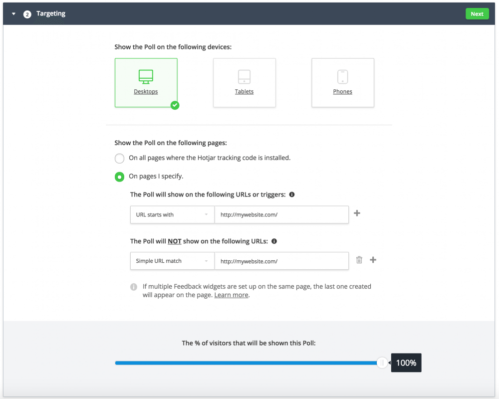
You may have noticed that I’ve set-up my example survey to only appear on desktop devices. In the next step, we’ll be configuring the survey to be triggered by cursor behavior (oooh creepy). Obviously, cursors don’t exist in tablet/mobile-land, so you’ll want to setup a slightly different survey to target users on those devices.
You’ll also notice that you have the option to show your survey to a certain percentage of visitors. This is helpful if your site gets a lot of traffic and you can’t afford to spend hours analyzing thousands of free-form text responses.
In my experience, the the average response rate is usually somewhere in the 0.1% to 0.3% range. Assuming that holds true on your site, that means you could reasonably expect to get about 1-3 responses per 1,000 visitors. All things being equal, more responses is better, but you’ll need to consider your own practical limitations when it comes to processing the results. More on that in a moment.
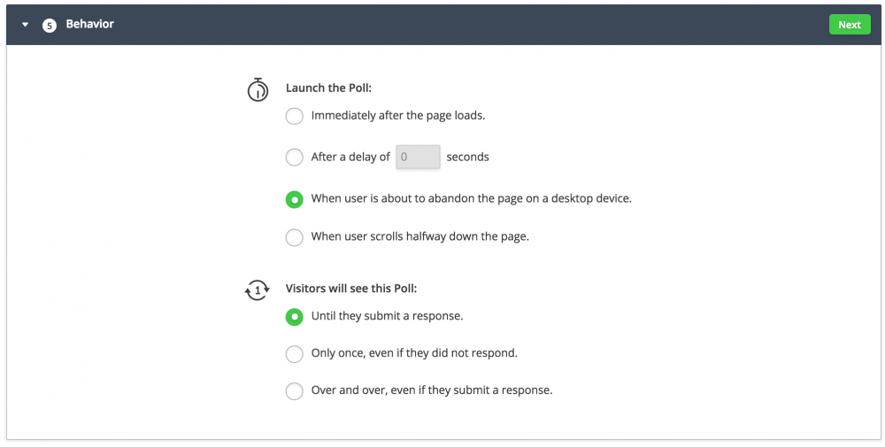
Survey Behavior
Now that you’ve determined where the survey will appear, you’ll also want to consider how the survey will be triggered on those pages. A good survey tool will give you at least handful of options ranging from time on page to how far the user has scrolled down the page.
My favorite approach is using an “on-exit” trigger. This means the tool will attempt to display the survey only when the user’s cursor indicates they’re about to hit the back button or close the tab. In theory, this means our survey should catch the user after they’ve managed to complete their task or given up all hope. That’s prime time if you’re using Kaushik’s three-question format.
I also prefer to set my on-exit surveys to keep appearing until the user submits a response. That has the potential to be annoying, but because we’re only triggering the survey on exit, users should only see it once per visit.
Of course, there are more aggressive settings, but I generally shoot for the assertive-but-not-tacky sweet spot, which is admittedly a somewhat arbitrary aesthetic decision on my part.
Analyzing Your Results
 With any luck your survey will start generating responses in short order. And, if you’re like me, you’ll have to consciously fight the urge to login throughout the day to read the latest submissions.
If you’re using Kaushik’s three-question survey, the analysis is pretty straightforward. Your basic approach is to scan the responses looking for consistent themes. From there you can assign %s to each theme and generate a prioritized to-do list for improving your website.
As you dig in, you may wonder how many responses you need to get “valid” results. After all, you wouldn’t want to make sweeping, expensive changes to your website based on nothing more than a handful of potentially misleading responses.
While that’s definitely true, you need to be careful not to fall into the trap of thinking that only statistically flawless survey results will do. There’s a healthy middle ground.
I find it always helps to remember the larger goal. Ultimately, you’re doing nothing more than testing your own assumptions around what it actually feels like to be a customer using your website. That said, no one’s suggesting your survey should be the be-all, end-all source for insight. Instead, think of each response as an additional thread of evidence that can sharpen, expand, and add context to your thinking. Ultimately, it’s up to you to consider this evidence alongside all the rest to make the best decision you can.
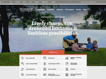
Uncovering Overlooked Use Cases in a City’s Website
Here’s an example of how that played out during one of our website redesign projects. In this case, our client was a municipality looking to redesign its badly outdated website.
During the discovery and planning phase of our project, we gathered multiple threads of evidence ranging from site analytics to anecdotal reports about frequently asked questions and complaints from residents about the website.
Not surprisingly, our client pointed out how important utilities-related information was on their existing site. And, paying a utility bill was the number one thing users were looking to accomplish. This was supported by site analytics which showed the online utilities payment page was the second most popular page on the site.
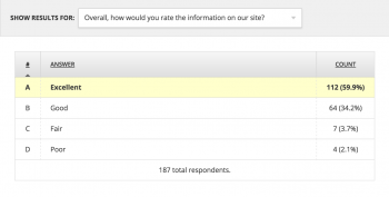
User surveys revealed a much more nuanced picture, however.
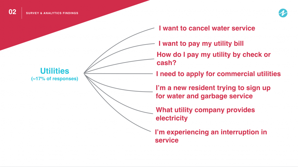
Roughly 17% of all responses were related to utilities, making it more popular than any other single topic. What surprised us was the diversity of responses within that broader topic.
The graphic below shows a selection of utilities-related survey responses.
Based on these responses, we were able to make a handful of helpful recommendations around how to improve utilities related information on the website. These included:
- Creating a new page titled Start or Stop Water Service which would reside in the a new resident-specific section of the site. (This information was on the site previously, but was buried four levels down on a page with commercial utility information called Utility Account / Field Services.)
- Creating a separate page titled Commercial Utilities which would be housed in a new business-focused section of the site.
- Creating new pages to link to electric and internet provider websites.
- Renaming the Online Utility Payment page to Pay a Utility Bill, and updating the page to include more detailed information about payment options.
It’s worth noting that none of our recommendations were particularly difficult, expensive, or risky. Instead, we were simply refining structure and content to accommodate scenarios we hadn’t previously considered.
We achieved similar insights with other sections of the site including Parks and Recreation, Public Works, and Government.
As you can see, user surveys are an easy, cost-efficient way to gather valuable insights directly from your customers, without the added time and expense associated with traditional research methods.